
Cream And Yellow | Grey And Blue | Grey Steel Finish | Red And Blue | Pink Pop | White And Blue | White And Pink | Wooden Tone | Yellow Pop
The colour palette you choose for your home is very crucial. The colours tell a lot about your taste and preference and do reflects your personality. On top of this, colour therapy pays a lot of emphasis on the colours that surround us. It governs our mood, health, and vibe as well.
So, you must choose the perfect home colour design ideas so that you will be able to create the right impression. Here, we will be sharing some of the different inspirations and ideas that will allow you to beautify your home.
Always remember, your home is the place you call your own. You should leave no stone unturned to make sure that your home looks really beautiful and perfect. We are going to share some of the different home colour combination ideas that you can choose for your place too.
1. Cream And Yellow
If you will like to have the overall tones subtle and not too loud, we will strongly recommend choosing this washed-out shade of yellow and dull cream. The overall blend is magical. You can use it in the living room, the lawn, and even the bedroom. The good thing is that a lot of elements will blend well with the colour code and thereby give you a feel-good theme. Yellow is also a preferred colour in colour therapy.
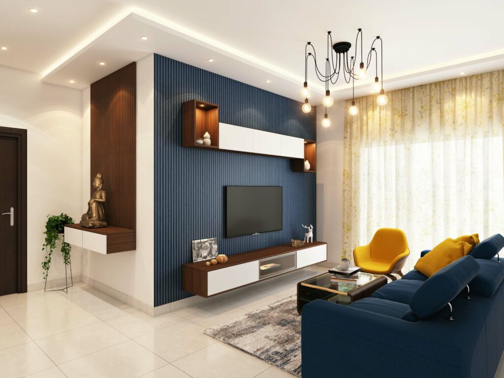
2. Grey And Blue
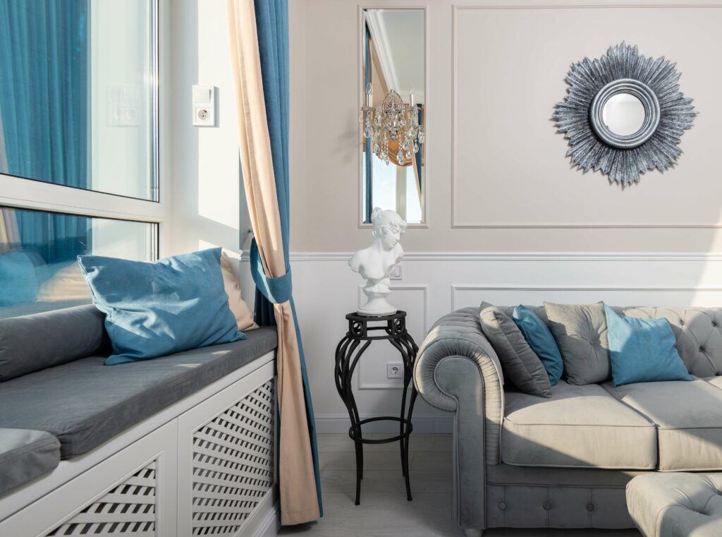
This is a modern and artistic combination that surely does its work well. The shade of blue should be vibrant and electric. This is because grey is very natural and you need a brighter tone to blend with it. If both shades are neutral, the combination doesn’t weave magic. This shade of blue leans heavily towards turquoise and can also be treated as a colour pop element. You can integrate elements of the blue shade to inspire an aqua theme in your room.
3. The Grey Steel Finish
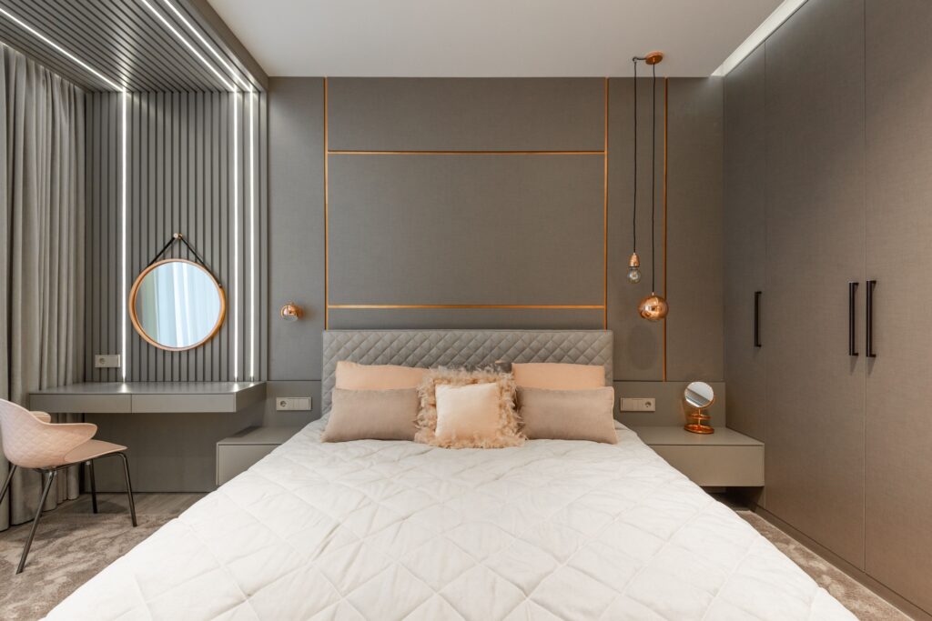
If you are a fan of monochrome colour design, you can choose this all-grey steel finish. This is meant for those who like sophisticated style. It is suited exclusively for the master bedroom as the design is apt for the main couple of the house. This lends a little official vibe to the room and thereby commands respect from the rest of the people. If you want your room to project authority and command respect, you can go for this all-grey finish. You can integrate silver and golden elements to add a little touch of elan further.
4. Red And Blue
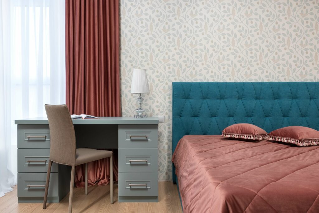
This is another perennial favourite choice and something that often surprises people. Whenever you think of the combination of red and blue, it looks like a bad idea. However, when implemented, the room is going to look all kinds of beautiful. You must make it a point to choose the right style and blend of colours. The way you integrate both these colours into the room is of pivotal importance. For instance, the bed can blend both colours. Have the padding done in blue while the cover sheet should have a red tone. This will help the overall room imbibe this theme and will make it look complete and perfect.
5. The Subtle Pink Pop
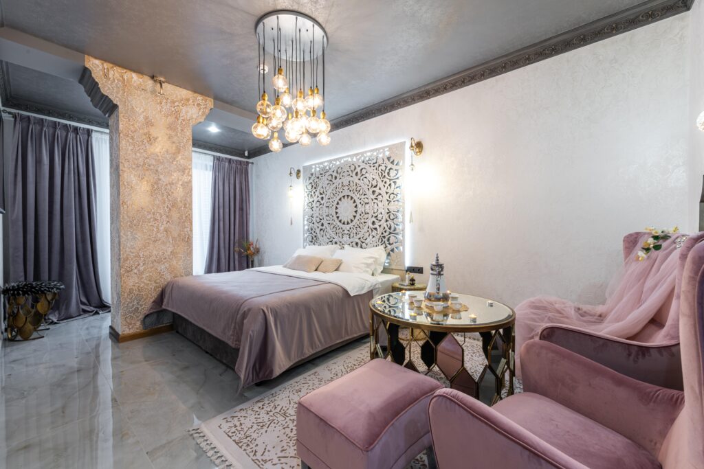
Every time we talk of home colour design, we just cannot ignore the fact that the season belongs to colour pop elements. A lot of people are choosing to do the whole room in subtle shades but incorporate a few colour pop elements. This is a great way to infuse modernity and rich taste in your rooms. If you have a love for the subtle pink shade (not the baby pink tone, especially for living or couple rooms), you can integrate this shade of purple pink and use it as a colour pop theme.
Have the big elements in your room done in this shade. It could be a large curtain or the recliner sofa or even the whole of the bed. You can also have big décor elements flashing this shade. When we talk of colour pop, it means that it won’t take up a lot of space in the room, but it will be the defining thing in the room. The colour pop element steals and seals the show.
6. White And Blue
This is the safest choice and one of the most elegant ones as well. The combination of white and blue has been the winning option for ages. You can always settle for this combination when you don’t want to experiment a lot. The overall blending of these shades is always going to be perfect. They seem to be well made for each other. You can use it in the living room or even the guest room. Blue is one of the best colours in the world of colour therapy as far as your health is concerned. It allows you to keep your blood pressure in check and can also control your anxiety levels. So, if you are suffering from such issues, you can choose this home colour design for your bedroom as well.
A darker shade of blue like royal or navy is better suited with white.
7. White And Pink
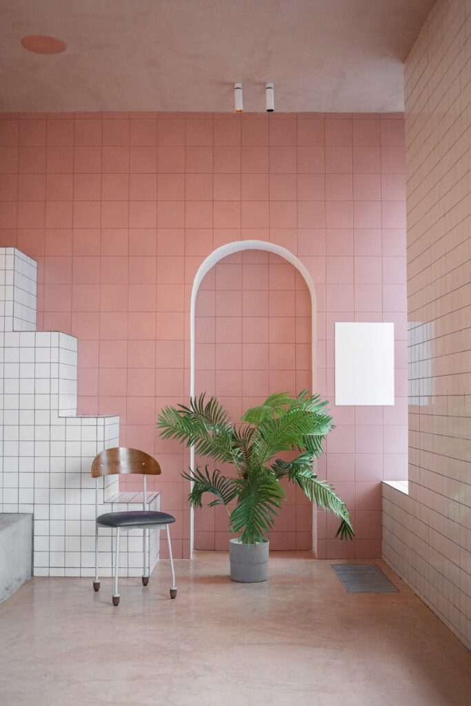
How could we talk of home colour designs and not have white and pink shades on our list? Here, the pink incline a lot towards coral and is somewhere in between the two. You can choose it in the living room to give a very soothing and eye-pleasing colour to the place. A lot of people believe that pink is a very girly shade but this shade of pink that is leaning towards coral doesn’t feel so.
You can integrate this shade amazingly well into the interiors of your room. It gives a balanced look. If you have big and striking elements in your hall, we always recommend going for subtle and lighter tones so that they can balance out the hues. This is one of the top interior techniques to beautify a place and make it look amazing.
8. Wooden Tones
If you want your home to have a vintage or rustic vibes or you just seem to love wooden houses and cottages, this design is for you. A lot of people love wooden undertones in their homes. If you live in a cold city, wooden homes are the real rage as the floors don’t get too cold. They also have the homely feel wherein you can get snug with your partner. Wooden cottages spell luxury and you can give your home the same feel by bathing it in the wooden shade.
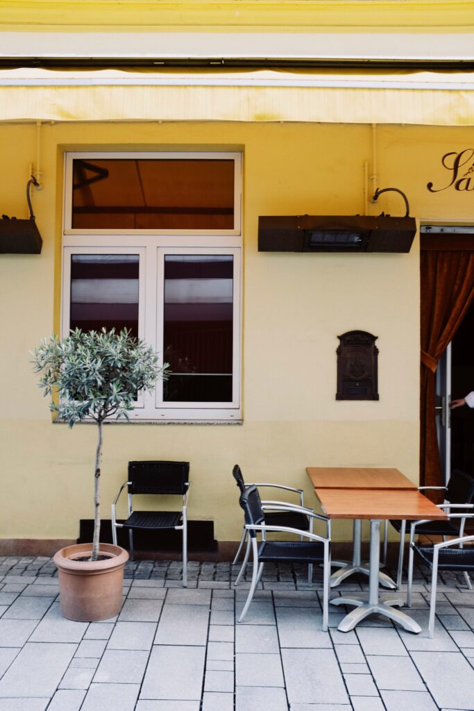
9. The Yellow Pop
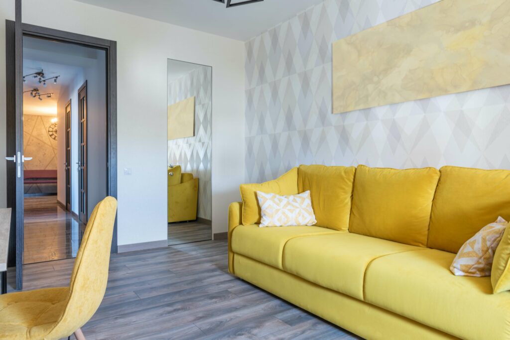
Last but not the least, another great colour pop you can integrate into your home has to be the yellow colour pop. Yellow has a way of making everything its own and you can see it doing exactly that in this image. It is a great way to make your living room the real centre of attraction in your home. It is also a feel-good colour and something that will cheer you up. So, if you don’t like gloomy homes or gloomy faces, smear your living room with this perfect home colour design.
So, these are some of the different options. Let us know which one you liked best.