
Colour Scheme | Front Door And Windows | Windows For 2022 | Door And Windows | Tips | Bottom-line
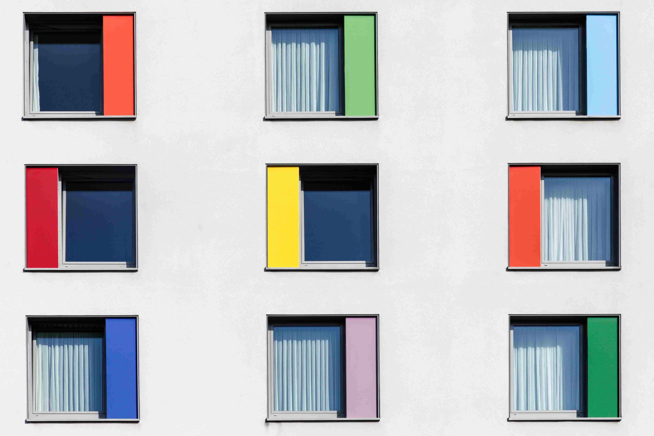
You might even want to consider a mix of these colours to create a unique look for your windows. Read on to find out more!
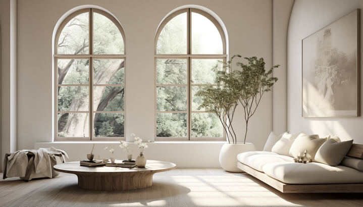
Beautiful and welcoming homes may be created using the proper window colour choices. White is a classic colour that works well with bright and muted tones. When it comes to windows, white is the most common colour. However, it may also add character to your outside walls. Window grilles in India have often been painted a soft yellow.
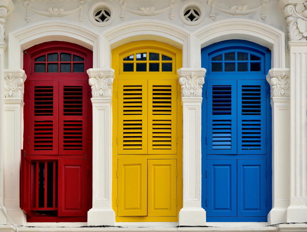
If you are trying to decide what colours to use for your windows, here are a few colour schemes: Cherry Red, Sunshine Yellow, and Mint Green. If you’re unsure about which one is best for your windows, consider what they will do for the overall design of your home.
There are several advantages to choosing this alternative, even if it isn’t for everyone. Here are some gorgeous window colour schemes for Indian houses you’ll ever see.
Choosing the Right Colour Scheme for Your Windows
The colour of the window frames should complement the style of the room. If you live in a contemporary home, you might want to choose a window frame that is modern in design. However, if you live in a traditional home, you may wish to select a colour that contrasts with the house colour. Depending on the style of the room, the colour may be used to conceal unwanted objects and add to the home’s overall appeal.
- You must carefully consider the surrounding area before selecting a suitable colour scheme for your windows.
- The colours of your house can either make or break the overall appearance of your home, so you must take into account what your windows are placed next to.
- Many colours can complement your windows, so it is essential to consider all of them.
- Depending on your home’s location, it may be helpful to consider colours similar to those in the surrounding area.
1. Cherry Red
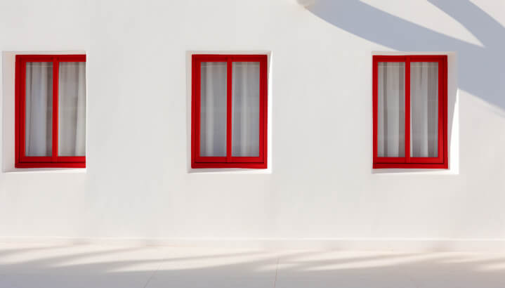
If you are considering changing the colour of your windows, consider Cherry Red. Its bright colour will add a touch of class to your home.
2. Sunshine Yellow
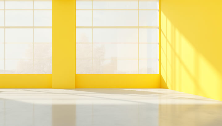
As a primary colour, yellow has many positive associations. The colour tends to boost confidence and curiosity. It has also been linked to learning and is known to promote positive attitudes.
3. Mint Green
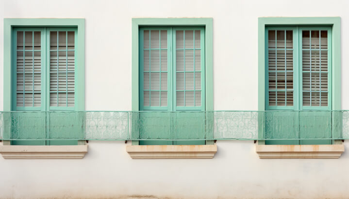
Mint green is a light, cheerful, and undeniably fresh colour. Even a novice home decorator can use it to create a sophisticated look. The colour pairs well with many other hues and works well in many different rooms. It’s stunning in a room with lots of natural light.
Colour Scheme & Designs For Front Door And Windows
When you are planning to redo your home’s front door and windows, you will want to select a suitable colour scheme and design. Your front door and window colours must complement your house’s overall colour scheme and layout. Choose colours that suit the central exterior theme of your home.
Consider your home’s colour palette and decide which colour will fit in with the overall design theme. For those who are hesitant to use intense colours, muted shades of red are recommended. However, if you are daring, go for vibrant colours!
- Study the colour wheel
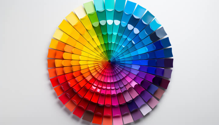
The Colour Wheel is a simple decoration tool that helps you decide on the colour combinations that will look good together. Using a colour wheel, you can choose a colour scheme that will complement your windows and doors and your home’s existing decor. There are four primary colour schemes:
- Monochromatic
- Complementary
- Analogous
- Neutral
- Pastel window and door colour shades
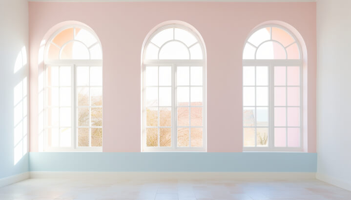
Pale colours have always been popular and are now experiencing a revival in interior design. They can highlight the window frames without detracting from the rest of the style. Pastels can also suit period properties, especially those of traditional design.
Choose the Right Colour Scheme for Your Windows for 2022!!
When choosing the perfect window colours, homeowners must consider the type of environment they live in. While light colours complement sunny and warm environments, dark colours can collect dirt. Neutral colours are a good choice because they are universally appealing. They also create a more cosy atmosphere.
Here are some tips for choosing the perfect colour scheme for your windows for 2022. Keep in mind that the choice of colour for your windows should be an expression of your personality and the environment.
- The ideal colour scheme for window grills
Regarding aesthetics, light blue is the optimal colour for window grills. The colour blocks light well, helping to insulate your home and reduce energy bills. It also has calming properties, helping to lower blood pressure and stress levels.
1. Chilling Blue
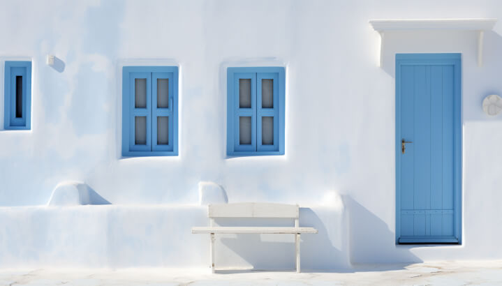
The colour scheme Blue is designed to create a calm atmosphere that inspires relaxation and calms the soul. It’s also a neutral shade, making it appropriate for various spaces. The blue-hued palette ranges in intensity from light to dark. And the same can be chosen for its connection with nature and ability to promote an optimistic outlook.
2. Coral hue
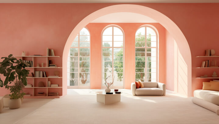
Regarding colour schemes, neutral colours like coral hues are always a safe bet. There is never a wrong choice with this colour, which will surely fit into any home. While trends come and go, homeowners want their homes to blend in and feel modern. This colour represents the balance of the natural world and is versatile enough to be used throughout the house. The same can be done to create a tranquil and soothing atmosphere.
3. Taupe
This colour scheme makes a home look clean and spacious and can even make low-light rooms feel more welcoming. Many shades of taupe will work well for your windows. Choose this shade because it is less stark and bright than a harsh, bright one.
Colour Scheme & Designs For Front Door And Windows
If you want to improve your home’s curb appeal, consider changing the colour scheme of your front door and windows.
Several popular colours will work well in 2022, from royal blue to two shades of green – sage and hunter green. If you’re unsure what colour scheme to choose, consider a neutral colour scheme, such as white. The neutral colours go well with everything and can help create a warm, welcoming front entry.
When choosing the colour for your front door, you should consider the exterior style of your home and the structure of your house. A classic black front door will complement traditional homes. On the other hand, a more modern home will look great with a brighter and more modern colour choice. If you’re undecided, consult the tips below –
- Cool Grey and White
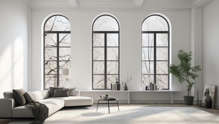
Light colours, for example, compliment sunny and warm environments, while dark ones tend to collect a large amount of dirt and dust. Neutral colours like cool grey and white are ideal because they appeal to most viewers and give a warm and welcoming feeling to a room.
- Pastel window and door colour shades
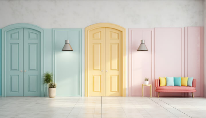
As the year comes to its middle, you may wonder what colour will be on your home’s front doors and windows in 2022. For those who aren’t sure yet, this trend is all about pastels, soft hues, and calming neutrals.
Here are some tips from design experts to update your home with the newest trends.
- Use pastels to add charm to your front doors and windows.
- Light, neutral, and earthy hues are the best choices for rooms with limited natural light.
- Pastel shades look great on doors and windows that face south or west. Light pastels are good choices for smaller rooms, but if you have more space, try a darker shade, such as black or tan. To add depth to these pastel hues, choose expensive textures. It’s the perfect colour combination for modern interiors!
- Effervescent Black
Yet another most popular colour on the list is Effervescent Black. This colour, such as a background image, is often used in e-commerce websites. Using the right colours can make your website look both professional and inviting. This bold colour scheme creates a simple layout that feels fresh and exciting!
Tips For The Best Window And Wall Color Combinations
When choosing the colours for your windows and walls, you can choose between many options to make a bold style statement. Follow the tips below for the best window and wall colour combination –
1. Create a style statement
Window and wall colour combinations should complement the overall style of your home. Your home’s colour palette should match the window frame, siding, and paint colour. Warm and cool colour palettes have different shades and hues, but both are generally warm colours.
Warm colours include red, orange, yellow, brown, and tan, which look best in traditional homes. Earth-tone shades are also beautiful choices for homes with a warm colour palette.
When selecting colour combinations for your walls and windows, consider the undertones of the colours you choose. Complementing undertones will give your home a harmonious balance, preventing it from being too warm or too cool. Complementing colour combinations for your window treatments and walls is also a great way to draw attention to a specific room. You can use complementary undertones for accent pieces to draw attention to particular areas of your home.
2. Be Traditional
When selecting colours for your window frames, be traditional and consider your home’s existing colour palette. The exterior paint or siding should match your windows, so they need to be the same hue. You can use a neutral colour like Classic Clay or Beige to create a seamless look. If you have windows that don’t match your wall colour, try a complementary coloured window frame. The colour will blend into the background and enhance the windows if you have a white house.
While it’s fun to follow the latest trends, stay within the colour wheel and choose window colours that match the exterior colour scheme. Remember that these colours will be in your home for many years, so be sure you’re comfortable replicating the colour and providing regular maintenance for wooden windows. Otherwise, you’ll be stuck with an aesthetically unappealing window that doesn’t fit your scheme.
3. Vouch for wooden hues
To create a harmonious combination, use wood colours as cues for wall colour selections. A green background enhances red wood, while a golden-yellow wood is attractive against warm reds or eggplant.
- On the other hand, medium greens bring out the yellow tones of wood, while a pale grey-green is an excellent choice for low-key drama.
- Red-toned woods can add a warm tone to a room but can also be overbearing. Choosing a warm neutral colour to complement wood can add a nice contrast layer, while blue-green blends can help lighten the space. In addition to warm wood tones, try choosing a wood finish with the right undertones.
- If you’re worried about matching the suitable wood stains, think about Edgecomb Gray, a warm light-medium grey with a slight purple undertone. This colour pairs well with woods with a yellow-hued tan or a red-inspired blond. Edgecomb Gray, meanwhile, is the perfect greige colour, sitting between grey and beige. While the colour will highlight dark wood, it won’t accentuate it as much as it would if you had opted for contrast.
The Bottom-line
Colour schemes for your home’s exterior depending on your house’s mass. A large house may appear too imposing, while a small one might appear floaty in the landscape. A midsized home is typically well-suited for a single, complementary midrange hue.
- When choosing exterior paint colours, consider the size of your home.
- If you are renovating your home, keep its size and style in mind to choose colours that go well with the exterior of your house.
- Depending on its scale, you can choose darker or lighter paint colours.
- Also, consider the architectural style of your neighbourhood to ensure that the colours you choose are contextual to the rest of the neighbourhood. Selecting a rich, warm colour for your front door can help keep it from getting lost among all the other houses on the street.
When selecting a paint colour for your home’s exterior, keep three main components in mind:
- the field colour dominates the entire scheme
- an accent colour is added to bring out the smaller parts
- a trim-painting colour brings out the trim
Each colour should stand out from the others without becoming overpowering. This way, your home’s appearance will look balanced and unified. You can even mix and match colours to create a unique look. Thus, keep these colour schemes handy for the home exterior.