
List | Charcoal | Turquoise Blue | Pastel | Shiny | Lavender | Orange White | Aquamarine | Blue Pink | Lime Green | Gold | Beige Cream | Magenta | Conclusion
Wall paintings carry an absolute sense in themselves that speaks of the stories of a household. Colour changes the mood of any individual in a fraction of a second. If you are renovating your house and looking for a perfect combination of POP colour design paintings, you have come to the correct section.
Have POP designs at your house that need a touch of colour? Playing and experimenting with paint allows you to create entire looks for your dining hall, living room, bedroom, kitchen, bathroom, study, and kids’ room. Try out these POP colour design painting ideas from our list below.
Are you also looking for plus-minus POP designs for decorating walls and ceilings?
POP Colour Design Painting
1. Charcoal Black POP Painting Design
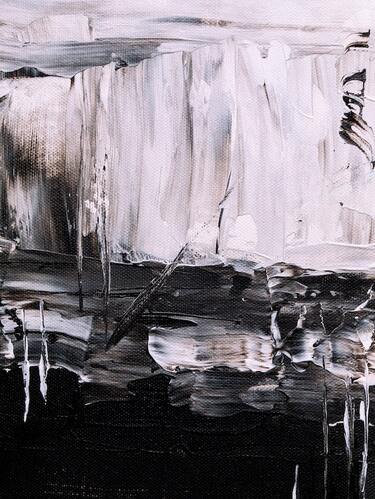
Charcoal black is a shade loved by the majority of individuals and designers. Though only 2% of the masses gather the courage to enclose this colour into their home, reviews suggest home decor looks extraordinarily stylish and refined with charcoal black as its paint.
2. Turquoise and Coastal Blue with Shades of White
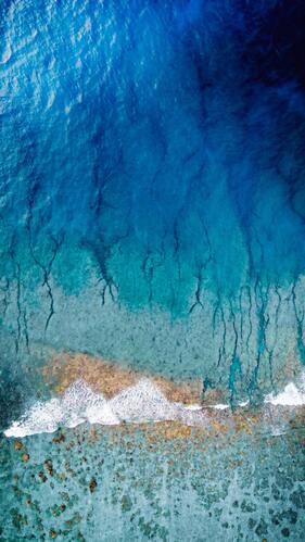
People who love beaches can give their home a breezy look while playing with colours. Once the house owners and the designers move ahead with taking the coastal blue Pop Ceiling Color as the primary paint for their house, there is no going back. After pairing the entire blue colour with different beachy motifs gives a vibrant look while giving life to the room.
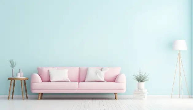
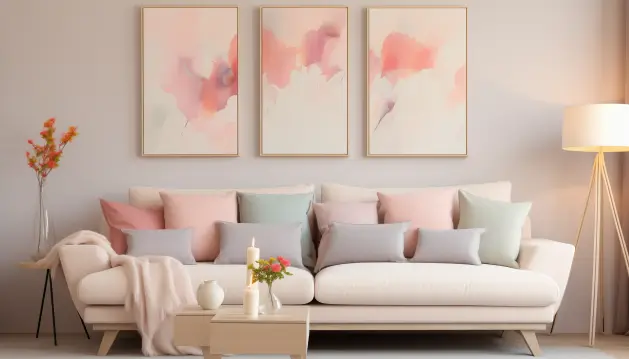
3. Partially Pastel Wall Colour
You do not always have to go all pastel when trying to revamp your space. A pastel pink works perfectly well with neutrals like white and black. All these colours work well with bright yellow making the place look bright and cheerful! For smaller areas, dual wall paint colours help segregate the personal corner and a cute little dining space.
Moreover, you can mix and blend different pastel colour combinations such as pastel green and pink, which gives a chic vibe to a room. You can also blend pastel peach and pastel off-white, which provides a picture with the perfect aesthetic for a space.
4. Shiny and Bright POP Painting Design
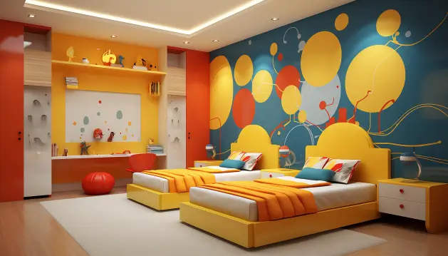
Generally, children love the idea of colourful bedrooms. Warmth and affection take the front seat rather than minimalism. The other decorative items and the beds alleviate the entire room with a splash of vibrant colours in the false ceiling. With the help of the gorgeous colours in the false ceiling, one can create a playful environment in the children’s bedrooms.=
5. Pastel Lavender Shade
Lavender walls bring an unexpected hint of colour to especially a dining room. You can use lavender on one wall and paint the other with shades of white or cream to offer the space a luxurious look.
This pastel shade is considered the most delicate of all. As if it is used accurately depending on the space, it creates a mellow and considerably calmer vibe. One should consider revamping their room with these colours, as it is already on the top lists of all interior designers!
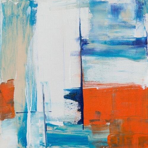
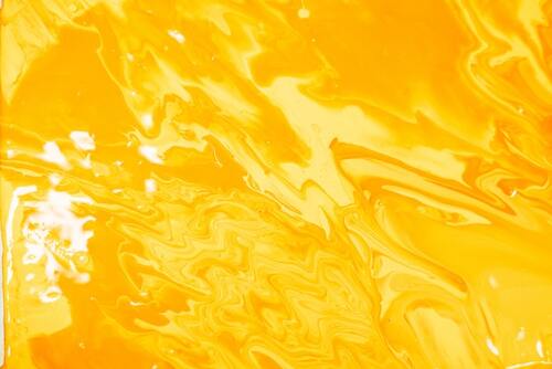
6. Orange and White POP Painting Design Idea
Orange creates a peppy look wherever painted. This colour will look equally good on your residence walls too. But the catch is that the one thing which will elevate the preppy look is adding white borders on the roof to complete the overall look.
7. Shades of Aquamarine POP Painting Design Idea

Bedrooms, relax lounges, and study rooms are generally painted with more smooth and relaxing tones of the colours. Aquamarine Blue is one of the pop paints that interior designers can look for. Aquamarine Colors are the first thing that people notice once people wake up. With the help of lively colours, the day starts with energy. Thus, Aquamarine Pop Paint is one of the favourites of all interior designers.
8. Sky Blue and Soft Pink Pastel Wallpapers
If you do not wish to go via the crisis of repainting a room but still like to give it a makeover, fear not! Pastel colour wallpapers are a prompter way to rework your walls.
A sky-blue flower-patterned wallpaper revitalizes the dining room, forming a refreshing vibe. When the wallpaper is used jointly with a matching blanket and cushions, the shade sets the mood for romantic and soothing pillow talk! On the other hand, a pastel pink space creates a romantic vibe that is ideal for a couple.
9. Lime Green POP Colour Painting Design Idea
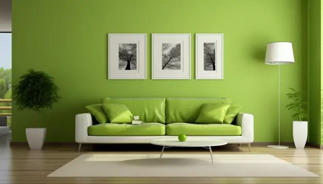
Green is a colour that symbolizes freshness and purity. The lime shade of green is the most vibrant colour that blends too well in order to boost the spirit. Add this shade to your ceiling to enjoy the essence of pure joy.
10. Vibrant Gold POP Painting Colour Design Idea
For people who love to flaunt their richness and want to design a house that speaks luxury and is extravagant, the right choice is the Regal Gold POP Paint. With the colours like gold and silver, there is a need to neutralize the other elements by using a neutral colour like beige or off-white.
You can use Golden colour in multiple ways, such as textured golden, or royal golden, With a touch of the exquisiteness of the highlighted gold.
11. Pastel Beige or Cream POP Colour Painting Design Idea
These classic pastel colours work almost perfectly with any decor style—the most versatile pastel colour out of the palette. No theme is undone without the remark of these two colours. Beige or cream wall paint has been used for ages and is a popular option.
Beige and cream together or in a single setting with off-white furniture would be like you serving yourselves some room aesthetics in a whiff.
12. Shades of Magenta with White POP Colours Painting Idea
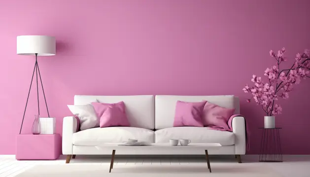
While keeping the base of the entire room or house white, the owners must add some colour to give life to the house. Architects and interior designers need to have the right taste to accomplish this. Magenta with a white background is the right colour to move forward with if you want to add a pop of shade while keeping the base of the house white.
Conclusion
Choosing the correct colour or painting design option for your house sometimes becomes a tedious job. But it is the most important of all as the colour of your home defines the vibe and the environment of the place you will be living in.
So, we hope that the above recommendation helps you choose the best POP colour painting design option!